Storybook SDC Addon
This addon streamlines the integration of Drupal Single Directory Components (SDC) into Storybook, allowing YAML-configured components (e.g., *.component.yml) to be dynamically loaded as stories in Storybook.
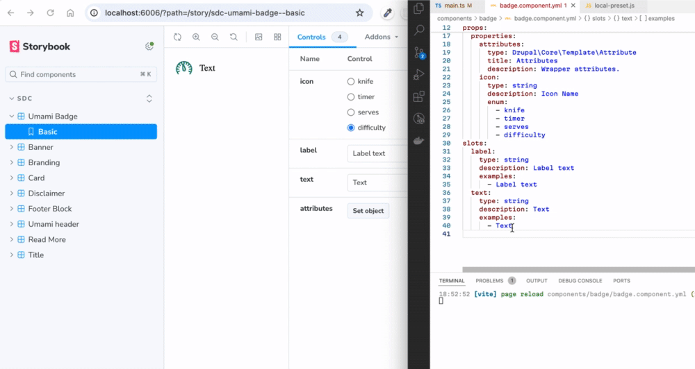
Table of Contents
- Overview
- Storybook Example Live
- Features of the Addon
- Quickstart Guide
- Configuration
- Creating Experimental Stories
- Support for Single Story Files (*.story.yml)
- Regular Storybook
- Configuration Options
- Setting Default Values
- Why Choose SDC Storybook Over Alternatives?
- Dependencies
- Known Issues
- UI Patterns
Overview
This Storybook addon makes it easy to integrate Drupal Single Directory Components (SDC) into Storybook using YAML configurations and Twig templates. It dynamically loads components, allowing you to quickly create and manage stories with minimal configuration.
It is still regular Storybook but now with the added option to import and manage Drupal Single Directory Components (SDC).
Storybook Example Live
You can view a live example of the SDC Addon in Storybook, hosted on GitHub Pages, showcasing components in the /components directory of that repository.
Features of the Addon
The SDC Storybook Addon simplifies the integration of Drupal Single Directory Components (SDC) into Storybook, offering several key features:
- Vite Plugin Integration: You can use either the vite-plugin-twig-drupal plugin (Twig.js) or the vite-plugin-twing-drupal plugin (Twing) to load and process Twig templates in SDC components.
- Dynamic Path Resolution: Utilizes namespaces to dynamically discover components within your project structure, eliminating the need for manual configuration.
- Story Generation: Automatically creates stories based on the YAML configurations of your SDC components, streamlining the story creation process.
- JSON Schema Support: Supports JSON Schema for props and slots, enabling the generation of mock data for missing values and ensuring data consistency.
- Drupal Behavior Embedding: Allows you to directly embed Drupal behaviors like
Drupal.attachBehaviors()into Storybook previews, ensuring components behave similarly to their Drupal counterparts. - Custom and External Schema Definitions: Supports custom and external JSON schema definitions to validate components based on Drupal-specific configurations (e.g., UI Patterns, Experience Builder).
- Default and Custom Story Rendering: Use
type: componentto nest components,type: elementfor HTML markup, andtype: imagefor images within stories. Or create your own custom renderers.
Quickstart Guide
-
In theme or module or just empty directory (If package.json not yet exists):
npm init echo "node_modules/" >> .gitignore -
Install dependencies:
npm i vite twig storybook-addon-sdc --save-dev -
Initialize Storybook:
npx storybook@latest init --builder vite --type html --no-dev -
Remove default storybook boilerplate stories (Optional):
rm -rf ./stories -
Configure as described in Configuration.
-
Add components to the
componentsdirectory (or copy from this repository). -
Set type: module in package.json:
{ "type": "module" } -
Start Storybook:
npm run storybook
Configuration
To configure the addon, update .storybook/main.js as shown below:
You can use this plugin either with Twig.js or Twing.js by setting the twigLib option to 'twig' or 'twing' in your configuration. Only one of vitePluginTwigDrupalOptions or vitePluginTwingDrupalOptions should be active, depending on your twigLib setting.
import { join } from 'node:path' // 1. Add dependencies.
import { cwd } from 'node:process'

const config = {
  stories: ['../components/**/*.component.yml'], // 2. Set components glob.
  addons: [
    {
      name: 'storybook-addon-sdc', // 3. Configure addon.
      options: {
        sdcStorybookOptions: {
          twigLib: 'twig', // 'twig' for Twig.js or 'twing' for Twing.
          namespace: 'umami', // Your namespace.
        },

        // vite-plugin-twig-drupal options. Comment if using Twing.
        vitePluginTwigDrupalOptions: {
          namespaces: {
            umami: join(cwd(), './components'), // Your namespace and path to components.
          },
        },

        // vite-plugin-twing-drupal options. Uncomment if using Twing.
        // vitePluginTwingDrupalOptions: {
        //   namespaces: {
        //     umami: [join(cwd(), './components')],
        //   },
        // },

        jsonSchemaFakerOptions: {}, // json-schema-faker options.
      },
    },
    // Any other addons.
    '@chromatic-com/storybook',
  ],
  framework: {
    name: '@storybook/html-vite',
    options: {},
  },
}
export default config
Creating Experimental Stories
The sdcStorybook configuration in the SDC YAML file provides a flexible way to define custom stories for your components. This feature allows you to use predefined props, custom slots, or even reuse stories defined elsewhere. Here's how it works:
Example Configuration
thirdPartySettings:
sdcStorybook:
stories:
grid:
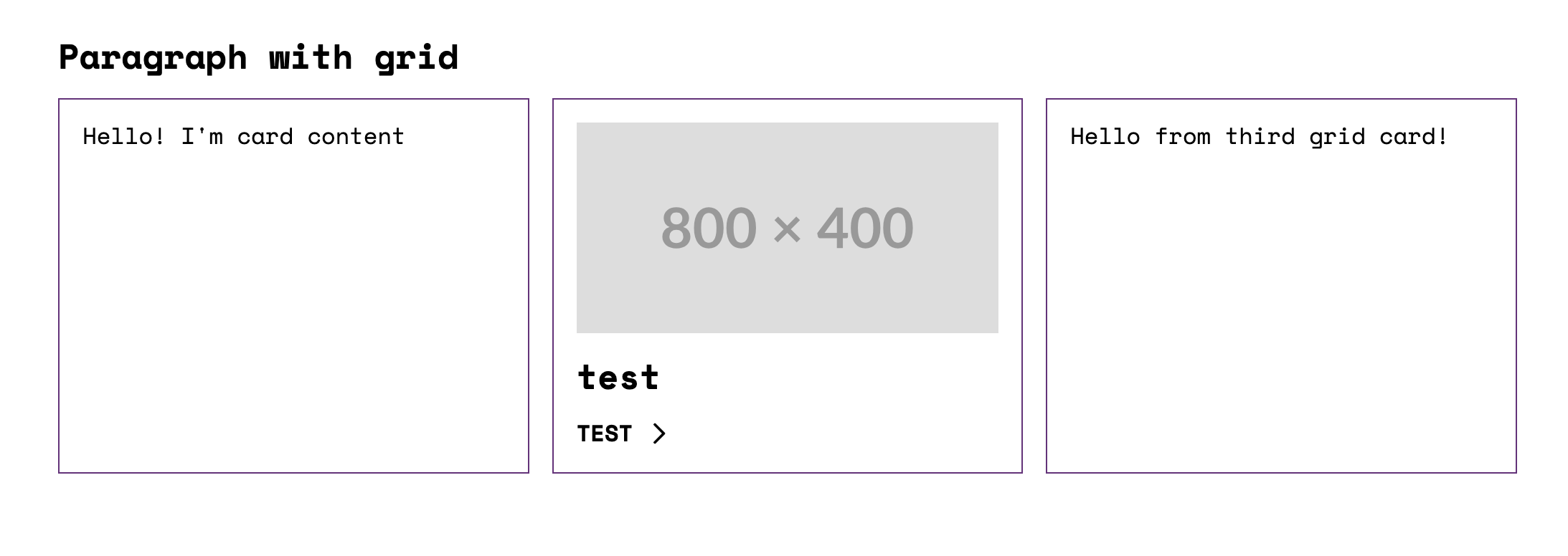
props:
label: Paragraph with grid
extra_classes:
- m-paragraph--grid
slots:
content:
# 1. Basic Props and Slots
# This card uses only the basic default props and slots defined in the component YAML.
- type: component
component: 'umami:card'
# 2. Predefined Story
# This card references an existing story (e.g., "Preview")
# from the component YAML, which includes predefined props and slots.
- type: component
component: 'umami:card'
story: Preview
# 3. Custom Props and Slots
# This card defines custom props to modify its behavior (e.g., setting
# the HTML tag to 'div') and custom slots to override specific content.
- type: component
component: 'umami:card'
props:
html_tag: 'div' # Custom HTML tag for the card container
slots:
content: 'Hello from third grid card!'
How It Works in Practice
The addon dynamically renders the components and stories as defined:
- Basic Args: The default
Basic.argsof theumami:cardcomponent are used. - Existing Story: The
Previewstory is loaded, ensuring consistency across the Storybook environment. - Custom Slots and Props: Overrides the default slots and props behavior with unique content for that instance.
Core and custom story node types
Plugin supports 3 core story node types: component, element, and image.
Use component to nest other components within your story.
type: component
component: 'umami:badge'
Use element to embed HTML markup within a specific tag.
type: element
value: 'Hello World!'
attributes:
  class: custom-class
Use image to embed images into your story.
type: image
uri: https://placehold.co/1200x400
attributes:
  class: custom-class
Example of using element and image in a story:
thirdPartySettings:
  sdcStorybook:
    stories:
      preview:
        slots:
          content:
            # Result:
            # <h2 class="custom-class"><span>Hello</span></h2>
            - type: element
              tag: 'h2'
              value: '<span>Hello</span>'
              attributes:
                class: 'custom-class'

            # Result:
            # <img class="custom-class" src="https://placehold.co/600x400" />
            - type: image
              uri: 'https://placehold.co/600x400'
              attributes:
                class: 'custom-class'
You can add custom renderers for additional story node types.
For example, to render a custom icon type:
- type: icon
  icon: arrow
Add the following to your sdcStorybookOptions:
sdcStorybookOptions: {
  ...
  storyNodesRenderer: [
    {
      appliesTo: item => item?.type === 'icon',
      render: item =>
        JSON.stringify(
          `<svg class="icon" aria-hidden="true"><use xlink:href="#${item.icon}"></use></svg>`
        ),
      priority: -4,
    },
  ],
  ...
}
Support for Single Story Files (*.story.yml)
In addition to stories defined inside *.component.yml files, the addon now supports standalone story files with the .story.yml extension.
This means you can create independent stories for your components by simply adding a .story.yml file in your component directory. These files are automatically discovered and indexed by Storybook, allowing you to organize and share stories outside of the main component YAML.
Example:
# components/slider/slider.badges.story.yml
name: Badges
slots:
  slides:
    - type: component
      component: 'umami:badge'
      props:
        icon: timer
      slots:
        text: Hello
    - type: component
      component: 'umami:badge'
      props:
        icon: serves
      slots:
        text: Bonjour
    - type: component
      component: 'umami:badge'
      props:
        icon: difficulty
      slots:
        text: Ciao
Why stories experimental?
The community will have to decide what format the YAML stories should be.
Regular storybook
All Storybook functions work as usual, and you can import SDC YAML into .stories.js files.
import header, {
  Preview as HeaderPreview,
} from '../components/header/header.component.yml'
import banner, {
  Preview as BannerPreview,
} from '../components/banner/banner.component.yml'

export default {
  title: 'Regular Storybook Page',
  render: () => {
    return `
      ${header.component({ ...HeaderPreview.args })}
      ${banner.component({ ...BannerPreview.args })}
    `
  },
  play: async ({ canvasElement }) => {
    Drupal.attachBehaviors(canvasElement, window.drupalSettings)
  },
}

export const Basic = {}
Configuration Options
- vitePluginTwigDrupalOptions: Options for vite-plugin-twig-drupal (Twig.js). Use when
twigLibis set to'twig'. - vitePluginTwingDrupalOptions: Options for vite-plugin-twing-drupal (Twing). Use when
twigLibis set to'twing'. - customDefs: An object with custom JSON schema definitions for your components.
- externalDefs: An array of URLs or local file paths to external schema definition files.
- validate: A URL or path to a JSON schema for validating your SDC components.
Twig.js with vitePluginTwigDrupalOptions
It is possible to pass options to the underlying vite-plugin-twig-drupal plugin. See vite-plugin-twig-drupal
vitePluginTwigDrupalOptions: {
  namespaces: {
    umami: join(cwd(), './components'), // Your namespace and path to components.
  },
  functions: {
    // You can add custom functions - each is a function that is passed the active Twig instance and should call
    // e.g. extendFunction to register a function
    reverse: (twigInstance) => twigInstance.extendFunction("reverse", () => (text) => text.split(' ').reverse().join(' ')),
    // e.g. extendFilter to register a filter
    clean_unique_id: (twigInstance) => twigInstance.extendFilter("clean_unique_id", () => (text) => text.split(' ').reverse().join(' ')),
  },
  globalContext: {
    // Global variables that should be present in all templates.
    active_theme: 'my_super_theme',
    is_front_page: false,
  },
},
Twing with vitePluginTwingDrupalOptions
It is possible to pass options to the underlying vite-plugin-twing-drupal plugin. See Twing documentation for more information.
vitePluginTwingDrupalOptions: {
  namespaces: {
    umami: [join(cwd(), './components')],
  },
  // (Optional) With twing hooks you can adjust twing environment.
  hooks: join(cwd(), '.storybook/twing-hooks.js'),
},
Sample twing hook file.
// .storybook/twing-hooks.js
import { createSynchronousFunction } from 'twing'

/**
 * Simple test function.
 */
function testFunction() {
  return 'IT WORKS!'
}

export function initEnvironment(twingEnvironment, config = {}) {
  const func = createSynchronousFunction('testFunction', testFunction, [])
  twingEnvironment.addFunction(func)
}
customDefs
The customDefs option allows you to define custom schema definitions directly within your configuration. This can be object with custom definitions.
Example:
const options = {
  sdcStorybookOptions: {
    customDefs: {
      'json-schema-definitions://experience_builder.module/column-width': {
        title: 'Column Width',
        type: 'integer',
        enum: [25, 33, 50],
      },
    },
  },
}
externalDefs
The externalDefs option allows you to specify an array of paths to external definition files. These paths can be URLs to CDN-hosted files or local file paths.
Example:
const options = {
  sdcStorybookOptions: {
    externalDefs: [
      'https://cdn.jsdelivr.net/gh/iberdinsky-skilld/sdc-addon@v0.4.3/drupal-defs/uiPatternsSchema.yml',
      'https://example.com/path/to/definitions.yml',
      './local/path/to/definitions.yml',
    ],
  },
}
When using externalDefs, the definitions will be fetched and registered automatically.
validate
The validate option enables schema validation for SDC components using the JSON Schema validator. By default, the validator checks the component configurations against the global schema located at:
$schema: https://git.drupalcode.org/project/drupal/-/raw/HEAD/core/assets/schemas/v1/metadata.schema.json
How It Works:
-
Global Schema Validation (Default): The addon uses the default global schema for validation. This schema is provided by Drupal and ensures that SDC components conform to the expected structure with the correct data types and properties.
-
Custom Component Schema: If a specific SDC component includes its own
$schemafield pointing to a custom schema, the validator will use that schema for validation instead of the global one. This allows for more flexibility and component-specific validation, especially when components have custom requirements. -
Validation Warnings: Validation errors or warnings are logged to the console, helping developers identify any issues with component configurations. Note: Validation will not break the rendering of the components. Even if a validation error occurs, the component will still appear in Storybook, and the warning will be logged for review.
To enable validation, set validate: URL of schema:
const config = {
  stories: ['../components/**/*.component.yml'],
  addons: [
    {
      name: 'storybook-addon-sdc',
      options: {
        sdcStorybookOptions: {
          validate:
            'https://git.drupalcode.org/project/drupal/-/raw/HEAD/core/assets/schemas/v1/metadata.schema.json',
        },
      },
    },
  ],
}
Setting Default Values
For json-schema-faker to generate reliable data, use default or examples in your SDC schema:
props:
  type: object
  properties:
    html_tag:
      type: string
      enum:
        - article
        - div
      default: article
slots:
  content:
    title: Content
    examples:
      - Hello! I'm card content
Refer to:
Why Choose SDC Storybook Over Alternatives?
While solutions like SDC Styleguide and Drupal Storybook are valuable, the SDC Storybook addon offers distinct advantages:
1. Component Independence and Modularity
- Following the BEM (Block Element Modifier) methodology, a component should work independently across environments.
- The functionality of your component must not depend on the Drupal version, or the active Drupal theme — it should be portable to any system.
2. No Complex Drupal Setup Required
- No need to install or configure Drupal dependencies for component development.
- Work faster by developing frontend components in Storybook without running a heavy Drupal instance.
3. Simplifies DevOps and CI/CD Pipelines
- Since components are isolated, testing and deployments are simplified.
- You can avoid Drupal-specific configuration in CI pipelines, leading to more efficient and maintainable workflows.
4. Scalability and Flexibility with Faker.js and JSON Schema
- Tools like Faker.js let you generate test data for components without needing real content.
- JSON Schema defines component data clearly and consistently, helping maintain data integrity.
5. Industry-Standard Tool for Frontend Development
- Storybook is widely adopted in frontend development, which makes onboarding easier, even for developers unfamiliar with Drupal.
- JSON Schema enables working on components without deep Drupal knowledge, opening the project to a wider developer base.
6. Drupal-Specific Behavior Embedded in Components
- Embed Drupal behaviors (like
Drupal.attachBehaviors()) directly into Storybook previews, ensuring consistent component behavior between Storybook and production. - Supports
drupalSettingsandonce.js, so components in Storybook behave identically to their Drupal counterparts.
7. Twig.js, Twing, and Drupal Twig
While using Drupal to render components offers tighter integration, there are strong reasons to use Twig.js or Twing in many scenarios:
- Many components don’t need full Drupal logic. Basic components (buttons, cards, lists) rely on simple HTML and CSS, not on complex template logic. For such components, Twig.js or Twing provide sufficient rendering without the need for full Drupal preprocessing.
- Twig.js works well for most frontend-focused use cases.
- Twing is a modern, actively maintained Twig implementation for Node.js that offers better compatibility with Drupal's Twig features and syntax.
- Styling and behavior mismatches can be managed separately in the Drupal implementation phase.
Dependencies
- vite-plugin-twig-drupal: Loads Twig with Drupal functions in twig.js.
- vite-plugin-twing-drupal: Loads Twig with Drupal functions in Twing.
- json-schema-faker: Generates mock data for missing props and slots.
- JSON Schema validator
Known Issues
- The addon relies on Experimental indexers.
UI Patterns
- Variants are partially supported (Issue 3390712).
- Custom Twig filters and functions are not supported (UI Patterns TwigExtension).
